Technology is always testing my patience and the level of frustration that I feel while visiting a buggy, illogical or uninformative website that is supposed to help me with a problem is total.
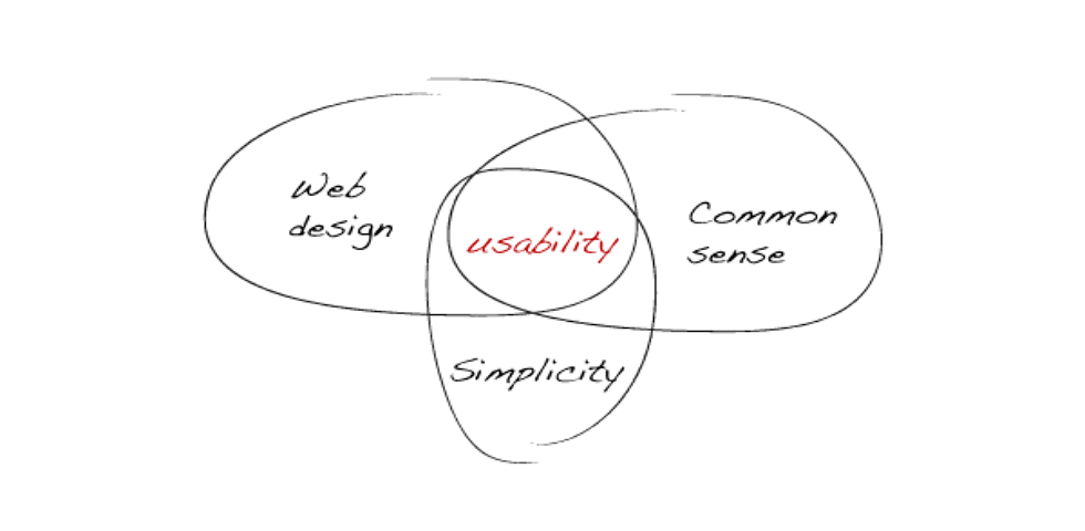
There is certain things that me as a consumer, or a person looking for information expects to see while visiting certain web addresses and this really became clear to me when i the other day in class, heard about Jacob Nielsen and his 10 usability principles.
Reading about this made me think about a particular website that I often visit and that what of the principles i personally think they succeed with and how they are presented.
I visit the online auction website https://www.bukowskis.com a few times a week to look at antiques and design objects, and I thought it could be interesting to see where Bukowskis web function and design succeeds in reference to a few of Nielsens principles.
One of the principles that I personally think Bukowskis is successful in is on how their system is keeping the users up to date on information to help with their purpose of buying or bidding on objects on their website.
For example on how long time the auctions has been going on and for how long I can bid on or buy the object.
Another thing that I like about Bukowskis website is the aesthetic and minimalist design. The website has a very minimalist and uncluttered logo, and I like how they are highlighting the pictures of the beautiful designer objects that will catch the users eye and spark the users wants and needs that will lead to them consuming. Nielsen talk about the the importance of not having to much irrelevant or rarely needed since it competes with the relevant units of information.
The last thing that that i want to bring up is the websites ability to make it easy for the user on how they have the same home-panel visible on the top of the page wherever and however you decide to go forward at the website. This makes it very easy for the user to get around and reach the different functions from every situation.
The last thing that that i want to bring up is the websites ability to make it easy for the user on how they have the same home-panel visible on the top of the page wherever and however you decide to go forward at the website. This makes it very easy for the user to get around and reach the different functions from every situation.
You find all 10 principles by Jacob Nielsen at: https://www.nngroup.com/articles/ten-usability-heuristics/
I agree with you totally, usability cannot be underestimated when analyzing the concepts of a qualitative website design
SvaraRadera